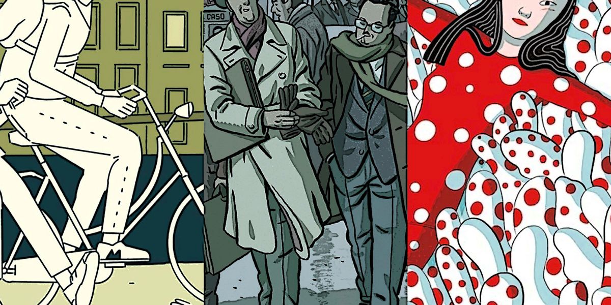
They say you can't judge a book by its cover, and the maxim is even more accurate for graphic novels.
This surprised me when I first started reading graphic literature – in a medium that is so heavily iconographic, surely it must be possible to glean something from the cover? Yet for some graphic novels, it's neither the art which defines a book's quality, nor its literary aspect. Rather, the magical quality that makes or breaks a work lies somewhere in that liminal space in which art and literature intersect. The result can be surprising. Sometimes a comic that is sparse in both art and dialogue can prove more rewarding than works which are at first glance more visually appealing, or packed with more densely researched and presented dialogue.
The Contradictions, by Sophie Yanow [Drawn & Quarterly]
Sophie Yanow's newest work The Contradictions -- her chronicle of a spring break spent hitchhiking around Europe as a young, queer American student abroad, together with her anarchist friend Zena – is a case in point. The Contradictions is a masterpiece of literary minimalism. Space and silence speak volumes in its panels, with the onus on the reader to fill in the gaps.
Despite the dearth of dialogue, the characters resonate in deep ways. One senses the yearning in each of them for something more fulfilling than their everyday – for adventure, change, renewal. Zena provides a prototypical example of radical ennui: the anarchist eager to stay in squats and shoplift her way through life. An American abroad in Europe, she's determined not to "debase" herself by visiting museums or tourist attractions, but she's at a loss for what to do with herself in their stead other than wander the streets aimlessly.
Sophie, the narrator, is torn between her inner-artist desire to scour local museums and comic shops, and the self-conscious restraint she exercises because she yearns for Zena's acceptance. The pair convince themselves that hitchhiking is a more interesting and authentic way to see Europe, but really? Most of their days are spent standing on the side of the road seeking rides, or stuck in the backs of cars engaging in awkward conversation with drivers (when they're not drowned out by thumping techno).
 Design Face Eye by Geralt (Pixabay License / Pixabay)
Yanow's narrative is not didactive in the slightest; she makes no commentary on her excursion. It is the bleak emptiness of the panels which exercises judgement, not the narrator. The closest she comes to pointing the reader in an interpretive direction is in the title. The Contradictions perfectly sums up her experience, which leaves her grappling with all the contradictions between desire, aspiration, and reality that emerge in any confrontation with self and other.
Yanow conveys volumes with her minimalistic technique. Backgrounds are often non-existent; the reader's focus is on the characters. Often their dialogue is non-existent as well, with meaning conveyed through the most subtle mechanisms: their stance toward each other, an awkward shuffle, the infinitesimal rolling of a barely discernible eye.
When panels are stripped down to their basics like this, the reader becomes hyper-aware of motion and tension, voraciously alert to movements and silences and the meanings they might convey. With another writer a minimalist style like this might come across as lazy and incomFantaplete, but in Yanow's work it leaves the reader with an immense sense of satisfaction.


